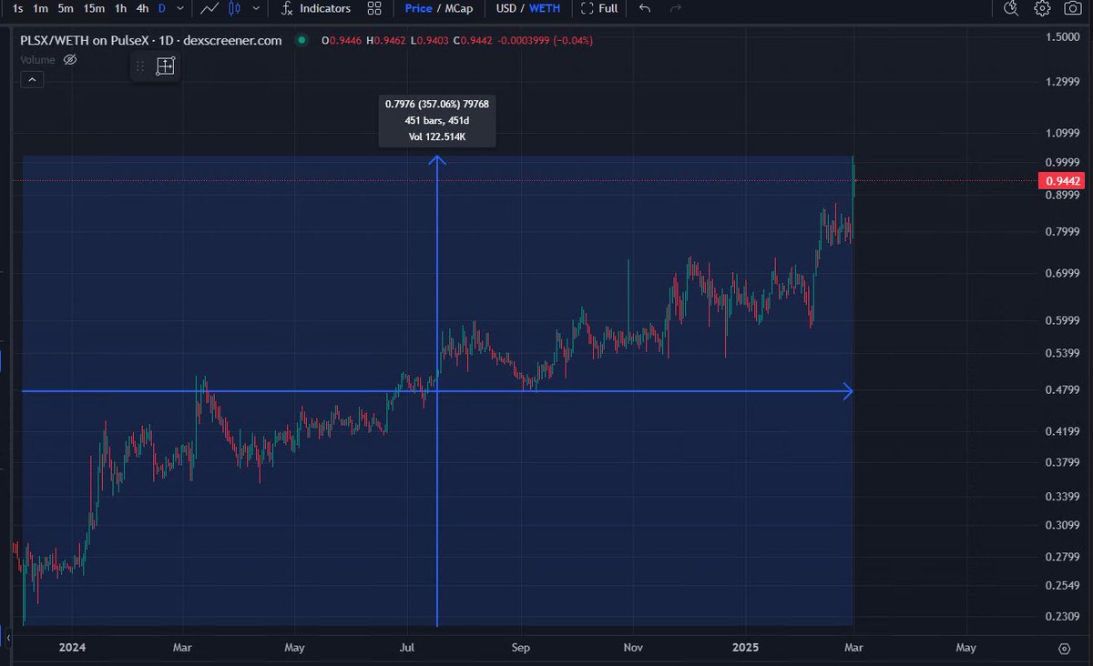
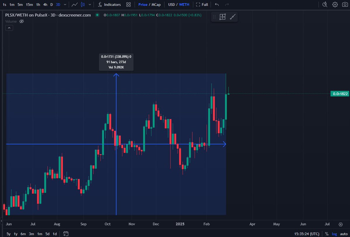
This is one of the best charts I've ever seen. I've never shown it before. This is the PLSX price vs Ethereum chart. People that swapped their ETH for PLSX are up 4.5x their ETH in 15 months. Look at how consistent it is!
People 'd their ETH then swapped.

This is a better chart: I don't know why that first chart appears to be showing the plsx/pls pair, when it clearly is indicating WETH not WPLS in the top left corner. Software error I guess.


I figured it out. Because PulseChain is a fully stateful fork of Ethereum, there's the WETH contract that came over in the fork. Which is just equal to 1 PLS (because you can convert them 1:1 at will.) What you care about is the WETH bridged in from Ethereum.

6.92K
224.02K
The content on this page is provided by third parties. Unless otherwise stated, OKX is not the author of the cited article(s) and does not claim any copyright in the materials. The content is provided for informational purposes only and does not represent the views of OKX. It is not intended to be an endorsement of any kind and should not be considered investment advice or a solicitation to buy or sell digital assets. To the extent generative AI is utilized to provide summaries or other information, such AI generated content may be inaccurate or inconsistent. Please read the linked article for more details and information. OKX is not responsible for content hosted on third party sites. Digital asset holdings, including stablecoins and NFTs, involve a high degree of risk and can fluctuate greatly. You should carefully consider whether trading or holding digital assets is suitable for you in light of your financial condition.

